Hey there —
In case you didn’t realize it — I almost didn’t — this 4th of July will be the biggest 4th of July in a generation. We are celebrating two hundred and fifty years! The semiquincentennial (say that five times fast). If there was ever a year to lean into red, white, and blue in your bedrooms — even just a little — this is it.
Here’s how to do it without your bedroom looking like a parade float.
Let’s Talk Color
An intentional story within a room (à la infusing some patriotic vibes) has to start with an intentional color palette. If you’re buying any red, white or blue without thinking first about how the hue and color temperature complement each other, your room will look like a collection of random Saturday shopping trips.
I’ve put together three color stories to help guide how to infuse some American pride into your space:
Vibrant Americana is traditional, energetic, and playful. Definitely not for the faint of heart, but for the purist who isn’t afraid to lean in.
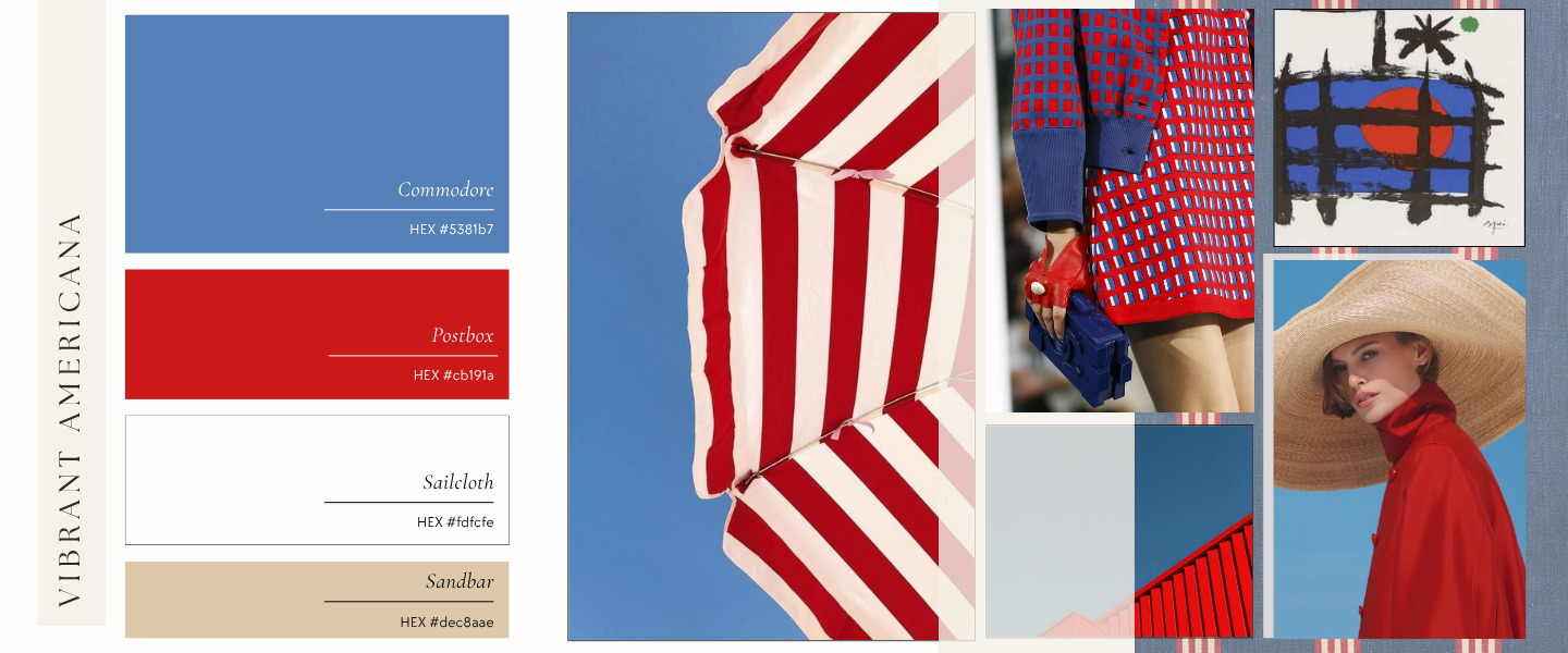
Commodore teeters on the edge of a classic Parisian blue — warm, calm, and grounding. That softness is what makes the whole palette work. Avoid anything pulling primary or navy; both will drag the room away from lively and straight into flag territory.
Postbox is that perfect red lipstick color. Not a primary red, but a vibrant, striking shade of red that pulls the look together.
Sailcloth keeps the space fresh and lets your eye breathe while utilizing what you probably already have in your bedroom — white sheets.
Finally, ground it all with hints of Sandbar. This will keep the space sophisticated amidst a vibrant palette that can stray into tacky territory.
Here’s how to actually put this on the bed:
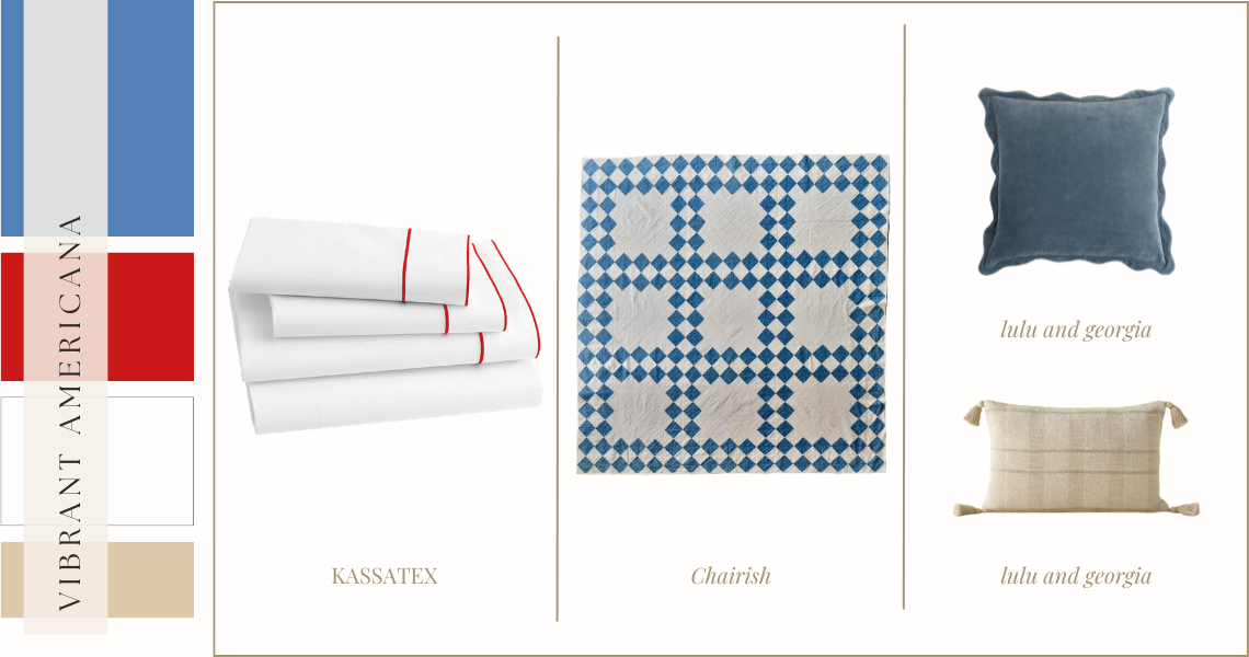
kassatex | chairish | lulu and georgia (top) | lulu and georgia (bottom)
I adore this quilt. It’s an antique, my guess is it’s hand crafted, and has history. It feels inextricably American and while some quilts can become a tad chaotic, the pattern here feels fun and traditional. Not to mention the color here is spot on. Layer it on top of crisp white sheets with a clean red piping, finishing it all with some colorful and textural pillows. Crisp, clean and vibrant.
Quiet Heritage is nostalgic, quietly confident and a little faded. This is the palette for the person who wants to nod to the holiday without announcing it — the room that feels like it has always looked this way.
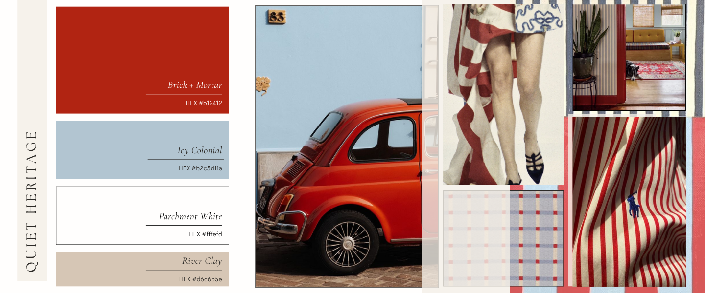
Brick + Mortar is your hero here, but watch this lady — it isn’t a bold and aggressive red. It’s a touch aged, earthy, and warm. Think less firecracker, more vintage postcard.
Icy Colonial is the friend who keeps Brick + Mortar grounded. This blue is soft, cool and almost hazy — closer to a morning sky than a flag. It plays beautifully against the warm red, keeping the entire vibe light and airy rather than stiff. Stay away from anything brighter or more saturated or you’ll lose the vintage quality entirely.
Parchment White keeps things honest. It’s not a crisp, clean white — it has just a touch of warmth to feel lived-in. This is the linen duvet you’ve had for years, the pillowcase that’s been washed a hundred times. That soft, casual, and lived-in feeling is the vibe.
Finally, River Clay ties it all together from the ground up. A warm, dusty neutral that stops the palette from floating away into something too pale and cool. Use it in your textures — a woven throw or pillow, a weathered wood frame — and the room will feel like it was put together over time, not all at once.
Here’s how to actually put this on the bed:
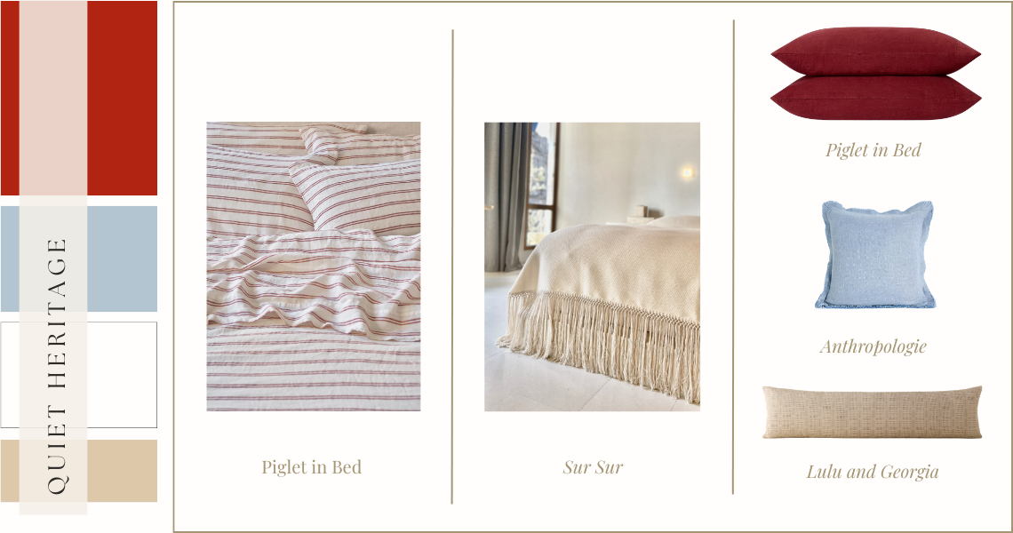
piglet in bed | sur sur | piglet in bed (pillows) | anthropologie | lulu and georgia
This. Coverlet. Is. A. Star.
The color, the fringe, and handcrafted. This standout piece comes from SUR SUR an Oaxacan artisan textile brand where every piece is handmade by artisans using backstrap and pedal loom techniques with each piece taking up to three days to complete. It’s gorgeous and an absolutely understated showstopper. Pair it with soft striped sheets to make it a little more casual if that’s your vibe, or dress it up a little with a solid cotton option. Tie it all together with pillows that align with the palette and there you have it. Bed made.
Have you ever noticed how when you don’t really feel like getting ready so you omit the full face of makeup, sweep on some brows and finish with a red lip—the compliments almost always come your way? There is something powerful about that one dash of red that instantly elevates your entire look. Your bedroom can do the same thing. The ‘unexpected red theory’ is when a small, potentially mismatched pop of red drops into an otherwise neutral space and automatically makes the room look better, more cohesive, and professionally styled. It doesn’t need to make obvious sense. But believe me when I say, it just works.
The Red Theory palette is the proof.
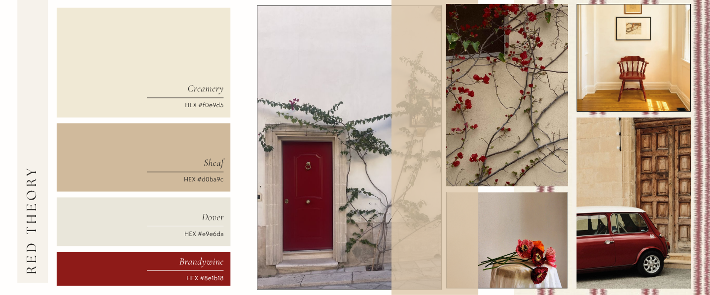
Creamery, Sheaf, and Dover do the quiet work — warm, layered neutrals that feel collected and unhurried. Then Brandywine walks in and the whole room snaps into focus.
Creamery is your foundation. A warm, creamy ivory that reads almost like plaster — not stark, just a hint of yellow and effortlessly luminous. This is your walls, your duvet, your starting point for everything else.
Sheaf adds weight and warmth without demanding attention. Think of it as the amber waves of grain — substantial enough to ground the palette but soft enough to blend with all the other colors organically.
Dover is the breath between the two. Cooler and lighter than Sheaf, it keeps the neutral layers from feeling heavy or monotonous. A Dover pillow next to a Sheaf throw is the kind of tonal layering that looks effortless and takes thirty seconds to achieve. My kind of bed-making.
Brandywine. She’s the whole point. A deep, sophisticated burgundy-red that doesn’t shout ‘look at me!’ It just sits in the corner confidently owning its space. One Brandywine pillow, a lamp on the nightstand — or the nightstand itself. That’s all it takes. Don’t overdo it. Restraint is necessary to make this work.
Here’s how to actually put this on the bed:
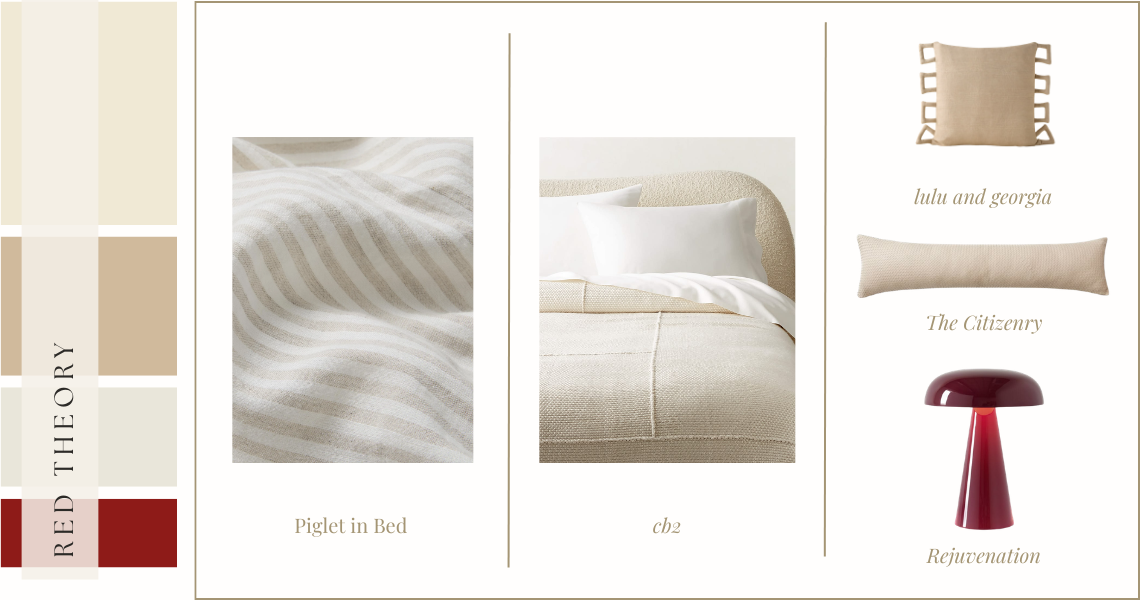
piglet in bed | cb2 | lulu and georgia | the citizenry | rejuvenation
Did your eye go straight to that fun lamp? Good. It did its job. Instead of layering red on the bed, I love the idea of pulling in a lamp to do the work. It keeps the bed chic, tonal, and timeless while still playing with red in the room. Because the color palette is so tonal remember that texture, shape and prints are your friend. A soft striped sheet, slightly nubby blanket, the interesting and playful shape of the throw pillow and the subtle texture on the lumbar (seriously, take a second to look at that woven leather up close) all work together to make this clean palette interesting. Throw in that red lamp and your bedroom looks like a designer’s hands were there.
Quick Note:
If you’re thinking of this for your guest bedroom, use cotton sheets. The most universally liked sheet material, you may polarize some of your guests if you make the bed with linen or silk.
Frack, I feel inspired. Honestly, I cannot decide which story speaks more to my soul. Nothing sounds more patriotic and romantic than setting the bed with some new bedding, lighting a candle or two, putting on some fun pajamas and laying in bed with a glass of champagne while listening and watching fireworks go off outside my bedroom window.
I hope this inspires you to do the same.
Happy 4th y’all. And Happy 250th, America.
Carli